OMFG these looks ace: http://www.1up.com/do/media?cId=3161157&sec=IMAGES


 Veteran Pilot

OMFG these looks ace: http://www.1up.com/do/media?cId=3161157&sec=IMAGES
Extreme Pilot
Leave no space unfilled - http://www.1up.com/do/slideshow?page...57&mId=3512023
 Extreme Pilot
Most of y'all have more experience with the Wipeout franchise than me-- but I don't see what is so terrible about the HUD?
The only annoying thing I see is that it isn't pushed back to the corners of the screen-- seems that the HUD items are too close to the center.
I wonder if Wipeout HD will take a cue from games like Metroid Prime and allow the HUD to be adjustable-- it would be cool to have the option of make the HUD items semi translucent, and to control their position on the screen.
 Zone Pilot
I'm still undecided on the main game HUD, I think it's generally OK, but the non-functional elements ( borders etc) are a little too busy.
The zone HUD is excellent, however
Zone Pilot
What i've noticed is that Anulpha Pass no longer looks like the F Zero look alike track (or so other people say). Praise be!
 Content Contributor
'generally OK' just doesn't cut it for a wipEout title, though. The franchise is famous for its style and graphic design. It is beyond me how they could come up with such an uninspired HUD, especially after seeing the bliss that Pulse's HUD is... they should've just made the Pulse HUD in high res - but I guess the same thing happened here that happened in the development of Fusion: 'hey, we got lots more graphical power now, lots more pixels to use, lets make it super-fancy with lots of detail!' - WRONG! A good HUD has to be simple, easy to read, not obscuring the action, dynamic. Fail in all categories here. Hell, to be honest, now that I looked at both, I even liked Fusion's HUD better than this, and I'm certainly not teasing here! Someone f*cked up big time. I sincerely hope this is going to be revised, but I fear it won't be...Originally Posted by Lion

 Zone Pilot
Nobody complains about Half - Life's hud, so crowded is obviously unsuitable.
 Extreme Pilot
To be honest, I love the HUDbut I would prefer it in the corners, allthough I can see the point in putting them towards the middle (big telly requires moving eyes around a lot to see the hud).
 Rapier Pilot
The only thing I would left unchanged is the lap counterand push it back to the corners, of course.
BTW I absolutlely LOVE the feisar zone craft, can't wait to see the rest! thanks everyone for posting this pics.
Content Contributor
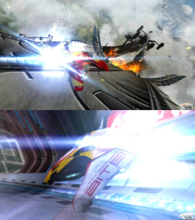
Just found a batch of special screenshots over at gamesradar - very sexy looking!
http://static.gamesradar.com/images/...screenshot.jpg
http://static.gamesradar.com/images/...screenshot.jpg
http://static.gamesradar.com/images/...screenshot.jpg
http://static.gamesradar.com/images/...screenshot.jpg
http://static.gamesradar.com/images/...screenshot.jpg
http://static.gamesradar.com/images/...screenshot.jpg
 Moderator
Legendary Pilot
Moderator
Legendary Pilot
HFS! :totallybug-eyed: > pic 6
and 3
and 2 and 1.
Veteran Pilot
Lance, you should edit your links
Again about the HUD:
Why didn't they just keep the HUD they had in their Games-Convention-Promo? With a bit more contrast maybe.
Moderator
Legendary Pilot
hm. I wonder why they turned out that way. Been nearly asleep all day [only an hour and a half of sleep this morning, none between that and previous morning's awakening. Yes, we old folk always take the advice to keep regular hours, regular meals, proper diet, etc etc. Suuuuuuure we do.] so I'm guessing that's why I didn't notice, nor do I feel like being arsed to find out why at the moment.
Phantom Pilot
Fabulous pictures. Would make perfect poster images. But something is missing...
That's more like it.
Veteran Pilot
I just don't understand why the don't keep the flare effect. WipEout without flare just doesn't work!
Phantom Pilot
i've just made the decision not to buy this, and in doing so not a ps3 until final fantasy xiii now. i love wipeout more than i can express, but the series has gone too far into f-zero territory now. pulse started it and every new screenshot of HD confirms my fears...and i HATE that HUD, it's something that is always there and it is just horrible to look at, it shouldn't be that way. I'm gonna keep my hopes up for the real wipeout ps3 game, and hell i'm sure loads of people will get this and have some good things to say, i'm sure people will say 'give it a go' but i had the same feeling with pulse, played it, dissapointed. poor tracks, shiny stuff everywhere and annoying weapon warnings...as i said i'm a big fan, but need to rant when one of my favourite game series' is letting me down. <end rant.
WipEout Creator
Big sprites or full-screen effects on PS3 = crippling on the framerate.
If it was 720p / 30fps, you'd be laughing.
Veteran Pilot
Just wondered because it was included in the G|C Promo... but then there were less details...
Shame that is.
Rapier Pilot
The overscan on many TVs will make the HUD look closer to the corners than in the pictures. Guess thats why many rather have the HUD closer to the middle than too far out in the corners.
Not that it will help the design though.
WipEout Creator
A few new shots.
http://www.gamereactor.dk/nyheder/69...eout-billeder/
 Posting Permissions

 Reply With Quote