Well, however you edit a skin offline, the huge pixels still come right back when you paste it into the online editor


 Venom Pilot

Well, however you edit a skin offline, the huge pixels still come right back when you paste it into the online editor
Zone Pilot
still you can smooth out the lines, more than online
Venom Pilot
Well, you can do that, but I've so far found that doing any fancy stuff using image editing software ends up using up a lot of your 16 colours on smooth shading.
EDIT: To bring this back onto the topic of skin posting, here's a quick W.I.P. of a wip3out Feisar that I'm working on.

Last edited by QirexAAX; 17th January 2008 at 10:47 PM.
Zone Pilot
that's true.
However, the online editor will never get as good results as photoshop, which is my point.
edit:
it looks great
Last edited by zargz; 17th January 2008 at 10:54 PM.
Venom Pilot
Sure because of the motion in that scene and in-game.Also, the way the textures are rendered in game is slightly more sophisticated than how they are in the editor, somehow - I don't know how it works. So skins always look better in game or in the Save? [ Y / N ] screen than in the main editor.
In the game it gets blurred a bit just like in that Y/N screen so you cant see the bloggy stuff.
By the way:
Just wanted to upload it on wipeout-skins but the site is down atm.
EDIT: Its up there now!
Last edited by GTAce; 17th January 2008 at 11:21 PM.
 Phantom Pilot
well i did notice in the editor, that some of the colors on the FEISAR craft are different than they are in-game (ie. the reds that are in the game are a dark yellow in the editor )
also QirexAAX, the Wip3out Feisar looks very nice

Last edited by BARTgai; 17th January 2008 at 11:34 PM. Reason: added
 Zone Pilot
WOW!Originally Posted by QirexAAX

Did you use photoshop to make this? The pinwheel is in great detail!

Phantom Pilot
well, i decided to dig up my old Wip3out-ish FEISAR and do a little more work on it. still need to fix little errors with the seams and whatnot

Zone Pilot
nice job!
Content Contributor
That's a really beautiful AG-SYS. I look forward to racing CR4SH3D in it online!!
Venom Pilot
hey, i was looking at the awesome skins posted on this topic, and felt the need to make a new one..
im kind happy with how it looks but at the same time if feels empty, please tell me what you think and ideas on how to improve.
http://img402.imageshack.us/img402/5...8025308dc7.jpg
http://img72.imageshack.us/img72/159...8025354xx4.jpg
notice it's not pure white i gave it some shadows to make it look like the jigsaw pieces had depth (it works better ingame but on the second picture you can see it more or less..)
also while i was looking at the photo folder i found this one that i took by mistake of my eg-x and it looks cool
http://img101.imageshack.us/img101/5...7211754sc2.jpg
Last edited by sakerbax; 18th January 2008 at 02:55 AM.
Zone Pilot
how to improve? --> http://wipeoutzone.com/forum/announcement.php?f=22
the jigsaw AG looks great, I wouldn't change too much.
may be put an AG logo or your nick on the side.
perhaps on the big piece of jigsaw on the left side under the cockpit?
Venom Pilot
oops tottaly forgot about that.. edited the post,,
50k is really small,, i guess i could compress the jpgs a little more but not today.. the whole upload process is boring =)
Phantom Pilot
//medusa
ii love it too, but dont race me late at night, im wasted and got beaten on venom >_<
//sakerbax
maybe add some peneling type effect to make out the crafters details a little bit more rather than having a solid looking hull
Zone Pilot
maybe the puzzle is an image of a world map or topography...you'll figure it out
Venom Pilot
@sakerbax: I think it looks empty because you painted over all the details (little arrows, logos etc.).
I need a higher res pic from the skin to give you some tips.
But overall it looks great!
 Venom Pilot
AXX, I sure know you and CR4SH3D have finished a wonderful skin for the AG.
CR4SH3D must be very proud of his new baby. It seams to me that it is even better, and more Japanese-like design then the original one. Way to go!
As for the Feisar it sure looks better then Bart’s (which wasn’t bad at all either).
-----------------
GTAce, nice combination of colors on that Harimau but I personally would rather try a different design instead of new colors
Phantom Pilot
//Ricanebleu
i love it
thats one hell of a compliment for qirexAAX since he did all the work, i just told him what id like to see untill it was right
Extreme Pilot
Yep, it's a lovely skin. Great work as always, QirexAAX!
Venom Pilot
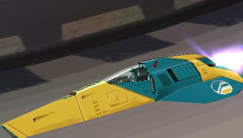
My Wip3out Feisar:
I've tried to keep at as simple as possible and as close as I could to the original, actually simplifying it so that it looked neat and clean and sort of cartoony.
Some more shots:
From above
Nose detail
It's not very showy but I'm pleased with the effect.
Ricane- I don;t think it's fair to say mine's better at all. I actually think BART's is a nicer looking skin, but mine is intended as a sort of replica skin whereas his is a sort of 'in the spirit of wip3out' design which, in my opinion, looks absolutely excellent.
EDIT: I just realised the Wip3out Feisar logo is not, as i believed it to be, the same as the Pulse Feisar logo. I've altered it on my skin but I can't be bothered to reupload a whole set of new pictures. Just imagine it's right.
Last edited by QirexAAX; 18th January 2008 at 06:56 PM.

 Reply With Quote