
Hi everyone. I'm TypeProton, 2D artist for SSGX.
We'll be using this thread to show some of our artworks. Feel free to comment and stay tuned for more.
Here are my take on in-game advertisements :


 SlipStream GX Developer
Venom Pilot
SlipStream GX Developer
Venom Pilot

Hi everyone. I'm TypeProton, 2D artist for SSGX.
We'll be using this thread to show some of our artworks. Feel free to comment and stay tuned for more.
Here are my take on in-game advertisements :
Zone Pilot
Even if I'm not a part of the team, is it ok for me to post my random ideas for stuff in here?
 SlipStream GX Developer
Extreme Pilot
SlipStream GX Developer
Extreme Pilot
Sure man, go aheadYou all can post some art and design work. I guess our main 2D artists TypeProton and dreadofmondays can give you the best feedback on it then.
 Vector Pilot
HELIOS Prototype.jpg
Just thought I'd drop this one in here
I have no idea how to make it a large image though, sorry about that! DX
SlipStream GX Developer
Extreme Pilot
Man that looks awesome
Zone Pilot
session-complete.png
I fear this got lost in the other thread. Are you guys still using the main menu design from ages back?
SlipStream GX Developer
Extreme Pilot
We are not sure about the menu design at the moment. What I can say about your results screen is that basically it is looking cool, I [and some others from the team] really like it. The only thing I personally like to add is that there are lots of numbers in a tiny area, it kinda takes a moment to get an overview. Can you somehow improve that a little bit?
What we plan to do with the results screen is having tabs. So people can switch between tabs and certain tabs get displayed, depending on which race mode you are in. You can check out the informations to be displayed here:
https://docs.google.com/document/d/1...ZgCc9CJ6U/edit
Zone Pilot
Ok I took what you said into consideration and made this mockup instead:
session-complete_v2.png
The idea behind this is that the most important element on each screen should also be the most prominent. Play around with the spacing.
Last edited by rdmx; 29th December 2012 at 05:20 PM.
 Extreme Pilot
rdmx +1
i like that it has a WHD touch
Zone Pilot
Remodeled Cassandra's startline stands:
Attachment 7215
Looks a lot better than the current world of flatness going on there...
Still need to texture and replace on Cassy, so yeah, tons of work left...
SlipStream GX Developer
Venom Pilot
Now that's a lot more readable. Awesome.Originally Posted by rdmx

@Xpand : Looking forward to final product.
Last edited by TypeProton; 30th December 2012 at 03:46 AM.
SlipStream GX Developer
Extreme Pilot
Yep, rdmx. The new version definately looks much better. I like it
Zone Pilot
Attachment 7218
Jup!
SlipStream GX Developer
Venom Pilot
Work in progress. Experiment, experiment...
Feedback would be good.
SlipStream GX Developer
Extreme Pilot
Cool thing, Type. I love the fact it's based on the japanese national flag. Only that big red banner... The logo feels a bit lost. Either scale it up or add that yellow W variation to it.
Zone Pilot
The big red banner, the text is nigh on unreadable.
 SlipStream GX Developer
Phantom Pilot
SlipStream GX Developer
Phantom Pilot
I love the Rise Up logo.
 SlipStream GX Developer
Extreme Pilot
SlipStream GX Developer
Extreme Pilot
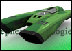
Just a little something from me
Prototype1livery full.jpg
Zone Pilot
Lol, looks pretty awesome. It looks like what Pure's AGS would look like if it was made for WO2097! xD
 Extreme Pilot
As an AG Systems fan, I can say I really like this.


 Reply With Quote
