-
22nd March 2005, 07:43 PM
#1
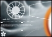
 The hacker skin
I've got photos.
Class selection (63k)
The league screen (61k)
Track selection (66k)
Team selection (70k)
Medals (75k)
Much nicer on the eyes when you are playing in the dark. Also it makes my gold medals shine that much more 
-
22nd March 2005, 07:56 PM
#2
ooo those are some nice pictures they are, *little ball in the jealously meter smashes out the end and goes off into outer space* :arrow:
I wonder what the menus will look like in team colours
-
22nd March 2005, 07:59 PM
#3
I'm so pissed man!!! I'm def gonna get a PSP, but when the price drops  But still there are always links to the under world!!! I will get my PSP for cut price MUWHAHAHAHA!!!!!!!................ I'll stop now
-
22nd March 2005, 08:18 PM
#4
You sir, are the man.
Those screens look impossibly sweet.
I cannot wait until I get my hands on this game.
-
22nd March 2005, 08:19 PM
#5
// true fact
The Hacker skin was created when the lead programmer accidentally deleted the default background texture. The story goes that Colin thought it looked so cool that they asked the graphic designers to create a skin based on it. Turns out the graphic designers hate it, but then they always hate stuff that gets done by accident - if it wasn't originally created with a higher purpose in mind designery folk tend to get a bit peeved with a good result! 
-
22nd March 2005, 08:20 PM
#6
Never mind. I see them. They're awesome.
I love that they have your rank at the head of Progress. Can't show that around until I've accomplished something, eh?
-
22nd March 2005, 08:30 PM
#7
Colin was right though. That skin is truly beautiful.
I'd probably go as far as to say that's the best front end in a Wipeout game (or any game for that matter) I've seen, and that includes previous tDR work.
Pure's designers must have bad eyesight to think this skin looks bad. 
-
22nd March 2005, 09:11 PM
#8
well, they have nailed every other small detail to perfection, so I for one will let them off this time
Changing menu colours seems a bit pointless to me. Perhaps i'm missing something but it just doesnt appeal that much.
However, if there was a wipeoutzone branded menu...... 
-
22nd March 2005, 09:30 PM
#9
-
22nd March 2005, 09:32 PM
#10
It's actually quite a good gag - the white one does get a bit tiring on the eyes if you're playing for a long time, so it's nice to have a change.
I'm looking forward to having the AG Systems one, although I haven't seen it yet, so I wonder if there is one... 
-
22nd March 2005, 10:38 PM
#11
In this case having a choice of menu skins is a wonderful thing. The screen of the PSP is so bright that the white one is almost retina searing (especially on the highest two settings in the dark). And the black one goes so well with the look of the PSP.
The first team logo skin should be harimau 
-
22nd March 2005, 10:43 PM
#12
That and the fact the hacker skin has all the style and grace of the past 400 videogames rolled into one.
Understated fantastic use of colour is magnificent, and practical in the dark.
-
23rd March 2005, 03:47 AM
#13
Absolutely beautiful!!!!!! Colin is definately very very smart!!!! He's a true Wiper!!!!
To me, the hacker skin seems like it's gonna be a classic, it reminds me of Wipeout 1 and probably others that I haven't played (too bad for me , oh well, at least I got a lot to enjoy !!!) Thanx for this, Sult|Ultra!!!! Let's try to post all the other skins onto this topic if we can, OK, unless, of course, you don't want to.
-
23rd March 2005, 05:52 PM
#14
I can post pics of the white one if anyone wants to see them. Right now those are the only two choices.
-
23rd March 2005, 05:58 PM
#15
I wouldn't mind seeing a few new screens.
For people interested, there's a link to a new video here. The quality is low, but it shows off the Pure's replay mode, which looks swish.
http://boards.gamefaqs.com/gfaqs/gen...topic=19928613
-
23rd March 2005, 06:15 PM
#16
-
23rd March 2005, 06:20 PM
#17
hmm the black one wins by miles
-
23rd March 2005, 06:21 PM
#18
Cheers for the pics.
The colour scheme doesn't 'feel' quite like Wipeout, but it's good to have the choice though.
-
23rd March 2005, 06:21 PM
#19
The black one is indeed the more futuristic looking one, I can't wait to see the team themed ones.
-
23rd March 2005, 06:26 PM
#20
I'm waiting for a skin with the color scheme of the splash page from the JPN site.
8O
 Posting Permissions
- You may not post new threads
- You may not post replies
- You may not post attachments
- You may not edit your posts
-
Forum Rules


 Venom Pilot


 Reply With Quote