
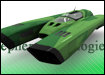
Hehe thank youWe went with a LeMans-alike design here


 SlipStream GX Developer
Extreme Pilot
SlipStream GX Developer
Extreme Pilot

Hehe thank you
Zone Pilot
Thanks! The team/pilot is actually from New Zealand!
 Extreme Pilot
Ah, yes, on closer inspection, that IS a NZ flag, not Australia. Still, that's awesome!
Zone Pilot
CEN-R is done!
Attachment 7678
 Venom Pilot
I like that Triakis exhuastlooking really good!
 Veteran Pilot
If it helps I would gladly contribute some of the sponsors done for the WipEout Deceit Project
Zone Pilot
Hey Sausehuhn.
Well the problem about using those sponsors is that we're not sure we can use Wipeout related content. We've been trying to contact Sony about that matter, but we haven't got any reply yet, so we're trying to keep all Wipeout references to a minimum. If we manage to get permission from Sony, then we will consider your offering.
Thanks!
Veteran Pilot
Yep, I can clearly see that. Then again, there’s still a hand full of sponsors left, not related at all
Zone Pilot
Well, ok, PM me your skype name so I can add you to the group for file sharing.
Vector Pilot
I love that Cen-R skin Xpand!
By the way, I noticed something interesting. Coincidence or inspiration? The first is the turbo symbol. The second one is the flag of the Aichi prefecture in Japan. Striking resemblance, no?
I stumbled across this because while I think everything else is looking brilliant (the tracks, ship models, item symbols), I feel that the team and sponsor logos are comparatively lacking. They don't have that same professional feel that everything else in SSGX has. Just compare the WipEout team logos to the SSGX ones. The WipEout ones just have a much more professional feel. I know, that kind of criticism isn't that useful, but I think in general the issue is that the SSGX ones feel too "busy". Especially Amphithere and Atlas. Also Ifreet and Logos look a little too similar.
Anyway, I thought that this page with all the flags of Japanese prefectures have some great ideas. A lot of those flags have very clean designs on them which seem to fit well in the WipEout universe. I wanted to get some inspiration and try to come up with some alternate team logo designs.
Long story short, looks like someone had a similar idea to draw ideas from these flags =) Either that or just an insane coincidence that they turned out so similarly!
If you mean that you're the one who made sponsors like Cosmic Cab, 12A Global Engineering, Katmoda Project, I-TEC Activator, and KING, SSGX would benefit greatly from your work! The sponsor mockups for WipEout deceit look outstanding. I imagine there shouldn't be any copyright issues since these aren't actually connected to the real WipEout in any way.Originally Posted by Sausehuhn

Last edited by SZEIKAN; 6th July 2013 at 11:11 AM.
Zone Pilot
Hey!
Thanks for the criticism. Yeah I also agree that some team logos need to be updated. Most of thost you said haven't been updated since like 2 years ago.
SlipStream GX Developer
Extreme Pilot
Hey there, thanks for your critique.
And you got 100%, our weapon logos are all inspired by the japanese city and prefecture symbols, only some are modified a bit. You can try to find all belonging japanese symbols for each pickup logo
But because of that we use won't those style of art at any other sponsor logo we have. The pickup symbols have to stick out to the rest of the art in the game, or better said: It has to be another group to fit in.
Vector Pilot
Ah yes, I just found oryxcake's original post and thought I recognized the Akita prefecture symbol. Also Hiroshima.
Anyway, glad to see you're considering updating the team logos. I also noticed TypeProton's sponsors just now and they're great. Well, there goes my primary concerns! Keep up the great work!
Zone Pilot
Solaris CP01A (Prototype)

 Veteran Pilot
Of all this time, through facebook and here, the jobs you`ve done are friggen awesome even sketches too. You all amazing artists!
stevie
Zone Pilot
The two last alternative skins are done.
Extreme Pilot
Hnnggghh. They look amazing!
 SlipStream GX Developer
Venom Pilot
SlipStream GX Developer
Venom Pilot
New league logo!
So we're shooting Japanese prefectures at eachother now?
Last edited by TypeProton; 31st July 2013 at 02:27 AM.
SlipStream GX Developer
Extreme Pilot
The biggest wins
Vector Pilot
I went to the website today and it's nice to see some of the team logos have been worked on =) Looking good. Not to mention the new Team pages are nice. Is the Advanced View not implemented at the moment?

 Reply With Quote


