
Oh, can I help if there's room? I want to create one of the racing teams.

 Venom Pilot

Oh, can I help if there's room? I want to create one of the racing teams.
 Phantom Pilot
zero3growlithe: "Someting is finally moving on this thread": what's that supposed to mean?
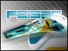
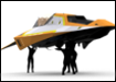
BTW here are a couple of old concept drawings that I talked about.
Last edited by Rotational_aspect; 17th July 2011 at 01:43 PM.
Vector Pilot
Those sketches are absolutely awesome! The colours are perfect!
Phantom Pilot
Solaristics: Thanks, its a shame I can't directly post larger images, these are a bit too low res. Here are four more below.
Like I said, I want to get away from the shadow of WipeOut style ships and break some new ground.
Some crits on your logos:
I like Antishock, Multicom, ZR and Core.
Human I find I dislike because the 'legs' of the logo are too tall. Perhaps shrink them so the logo is not quite as tall.
Motion Forward I dont 'get', as the company has a square logo when they do aerodynamics, which seems a bit off. But that could just be me. I do like the colour orange though in this logo.
Worm: I dont know what vector graphic package you are using, but if you can, round off the ends of the swirly logo so you dont have sharp right angles mixed with rounded text (to maintain consistency in logo/type).
Overall, it may be good to make each logo fit in the same square dimensions, as this makes them easier to use and place on textures- for example, can you reduce the antishock logos height to match ZR? I think it may make it look better.
But smart stuff!
Last edited by Rotational_aspect; 17th July 2011 at 03:03 PM.
Vector Pilot
Hey, thanks for the criticisms. Definitely need as much of that as I can get.
I completely agree with you on the Human logo.
Motion Forward I'm going to drop/change because I'm sick of the sight of it already haha.
I also had this dilemma when creating Worm. I did try the rounded ends but the logo didn't look as sharp and pronounced for some reason. I'll give it another try though and post the results.
Your sketches are amazing. The third one, Ship5ared is my favourite. LOoks like something from Akira the animated film. The ships look a lot more fragile and susceptible to damage. I don't see that as a bad thing, either. I think it could give the game a really cool feeling.
Have another sponsor:
Teddy Bear Refreshments:
Provide food between races.

Last edited by (•.•)™; 17th July 2011 at 07:56 PM.
Phantom Pilot
Great logo, nothing other than to say GREAT WORK!
And thanks for the kind comments about my designs.
Last edited by Rotational_aspect; 17th July 2011 at 09:01 PM.
 Phantom Pilot
I made a awesome team logo! Zero, does atlantis have a logo yet?
 SlipStream GX Developer
Extreme Pilot
SlipStream GX Developer
Extreme Pilot
This is Xpand's track. Ask him.
Zone Pilot
Atlantica.
No, it isn't... I can't seem to texture the track correctly in any way...
I'll just go ahead and continue the cassandra track model...
 Vector Pilot
Hey it's been one year since you started this thread =)
I have to say that looks amazing dude you should keep it on.
You could even sell it as a game xD Joke
 Extreme Pilot
CorrectedOriginally Posted by (•.•)™


Vector Pilot
can I ask what year in the future this game is set?
Vector Pilot
Thanksthat makes more sense!
Phantom Pilot
My game would be set around the 2030s. I am not sure what year the 'proper' fan game WipeOut is set.
SlipStream GX Developer
Extreme Pilot
Solaristics, use edit button next to quote button to conserve space and give moderators less work to do
Aspect, next to "something is finally moving (...)" there are words "more than usually" from which you can conclude meaning "thread pulse with life again"
btw. Unity is not so bad when i'm digging deeper and deeper into programming. I've even an idea on how to make good ship physics which i got fromv playing Little Big Planet... lol
Phantom Pilot
Man, I'm still a noob with logic! Textures, I made water (but no movement (I can with RHINO, maybe))!
Phantom Pilot
Got the charging shot script working. Player presses a key and the shot strength increases- release to fire. Shot strength is taken directly from the batteries.
To do- have a regular shot value (so if you press fire you get a weak beam instantly rather than having to wait).
And feisar rocket, everyone starts out somewhere- whats the problem?
Phantom Pilot
1. Not shields? What will batteries be for, weapons? Now it's like XG3. Shield pits and recharge strips = more thinking. I like that....Shot strength is taken directly from the batteries.
...whats the problem?
2. Everything...
SlipStream GX Developer
Extreme Pilot
About rhinoceros i can say one after going to maya... this program is completely not for making games!!! When i think about how long it took me to make a track in rhino and how i made it, and i see how it can be done in maya... my hands are dropping on ground with my jaw XD
Maybe it's easier to learn, but it's AutoCAD for making architectural models, so i think that you better stay with blender
(and you won't make a moving water in rhino as i saw that it's two same textures with bump mapping enebled moving in opposite directions... in rhino you can't make texture move
)
Last edited by zero3growlithe; 19th July 2011 at 04:12 PM.
Zone Pilot
I heard Rhino works with nurbs. That sometimes causes simple things like a box (which in all other 3D CAD software has only 6 polygons) to have too many polygons for a game engine to run properly.
Last edited by Xpand; 19th July 2011 at 08:37 PM.
 Posting Permissions

 Reply With Quote